Rio
Product design case study
Rio is a cloud-based, enterprise software solution designed to centralize daily workflows for drinking water and wastewater utilities of any size.
Initial prototype for Rio. Visualizations were key to helping users understand plant and water health.
The problem space
“Our primary product is water. Our secondary product is data.”
Municipal drinking water and waste water facilities are required to gather, report, and visualize data around every drop of water that passes through their plant. For even the smallest cities, this comes out to managing millions of gallons of water a day.
In general, most of these facilities rely on pen and paper to gather information about plant health and use out-of-date software to store that data or bulky and cumbersome spreadsheets.
Defining the solution
For our team, the solution revolved around making data easy to collect, manage, report on, and visualize.
The end result stretched across a number of different personas, each with unique concerns, pain points, and job functions that all worked together to supply and manage the stream of data.
The dashboard would function as a user generated quick view of plant operations and water health.
The Design methodology
To create Rio, I began by collaborating with our UX researchers to gain a deep understanding of the users' needs via field observation and user interviews.
Then, I led a series of design sprints - these were iterative working sessions where I worked closely with product managers, product owners, software architects and developers, as well as users to develop and refine the design solution.
I also began integrated UX into the core development scrum ceremonies to ensure that the user experience was central to every aspect of the product development.
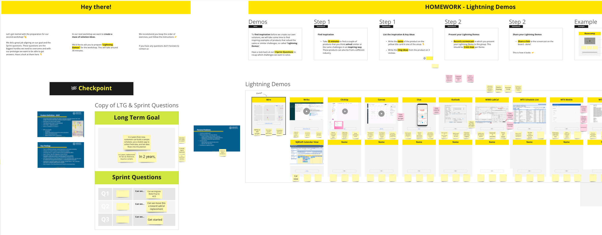
Facilitating design sprints with diverse business operations was key in discovering unique solutions to design problems as well as generating stakeholder alignment.
Personas
To create our personas, we used a combination of qualitative field visits and quantitative data from existing customer information.
These personas were not only useful in identifying the problems users face, but also provided a shared language for the product and development teams to better understand and empathize with the needs of a specific user group.
Our personas captured the main tasks that this type of user would perform at a water facility as well as their biggest pain points, their comfort with existing technologies, and the technology stack that they most commonly interact with on a day-to-day level.
Hank
Hank is responsible for a majority of a water facilities operations and compliance issues and became our central persona.

Rudi
Rudi is central to collecting data in the plant and around cities and counties.
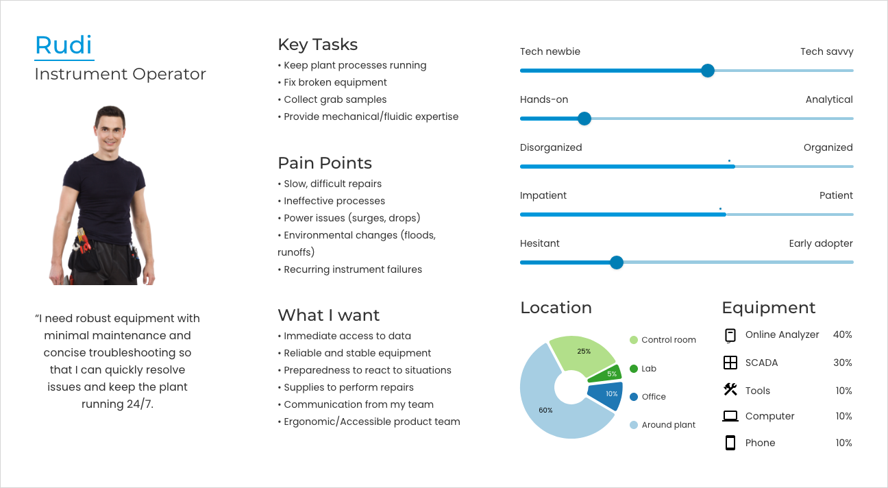
The research we did around defining Rudi would help untangle some major issues around the use and design of our mobile app.
Andrea
Andrea is our lab technician. They tend to work with both onsite and offsite facilities.

Andrea is one of the central personas we used around lab management.
Martin
Martin is responsible for creating and distributing compliance reporting.
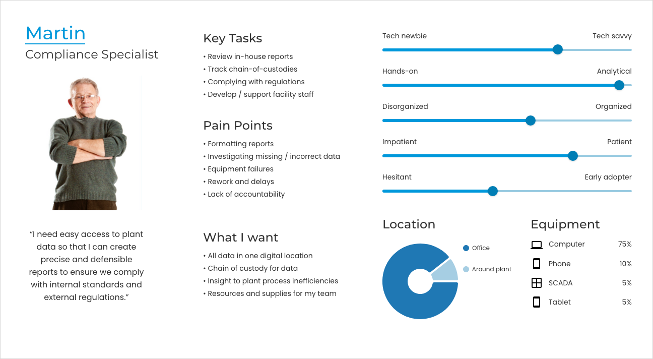
The roles of Martin and Hank would often overlap in smaller plants which pushed us to simplify the creation reports in Rio.
Rio design system
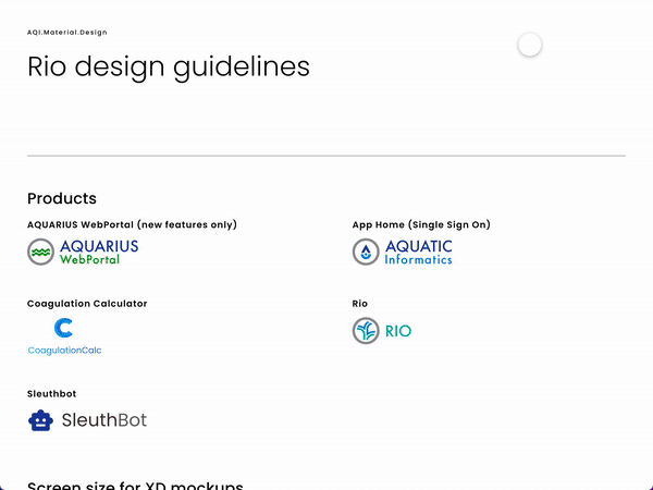
One of the most critical components to designing such a large system was the creation of a design system.
I created the design system using Material as a backbone while building out and adding new components unique to Rio as I designed.
The design system as feeds into the creation of the Hach design standards.
Every component specification is designed out for all common interactions and is stored in a shared library where other users can easily access it.
Features
We broke the user problems and needs down into features that would contain multiple user stories but captured a user’s work flow.

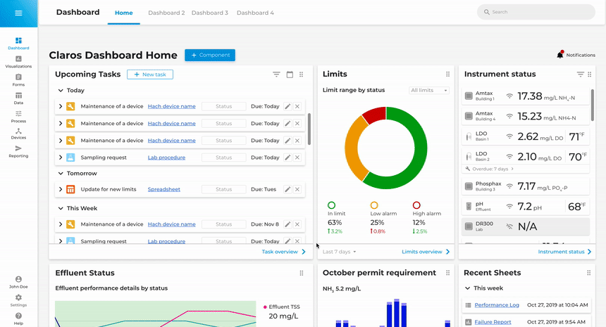
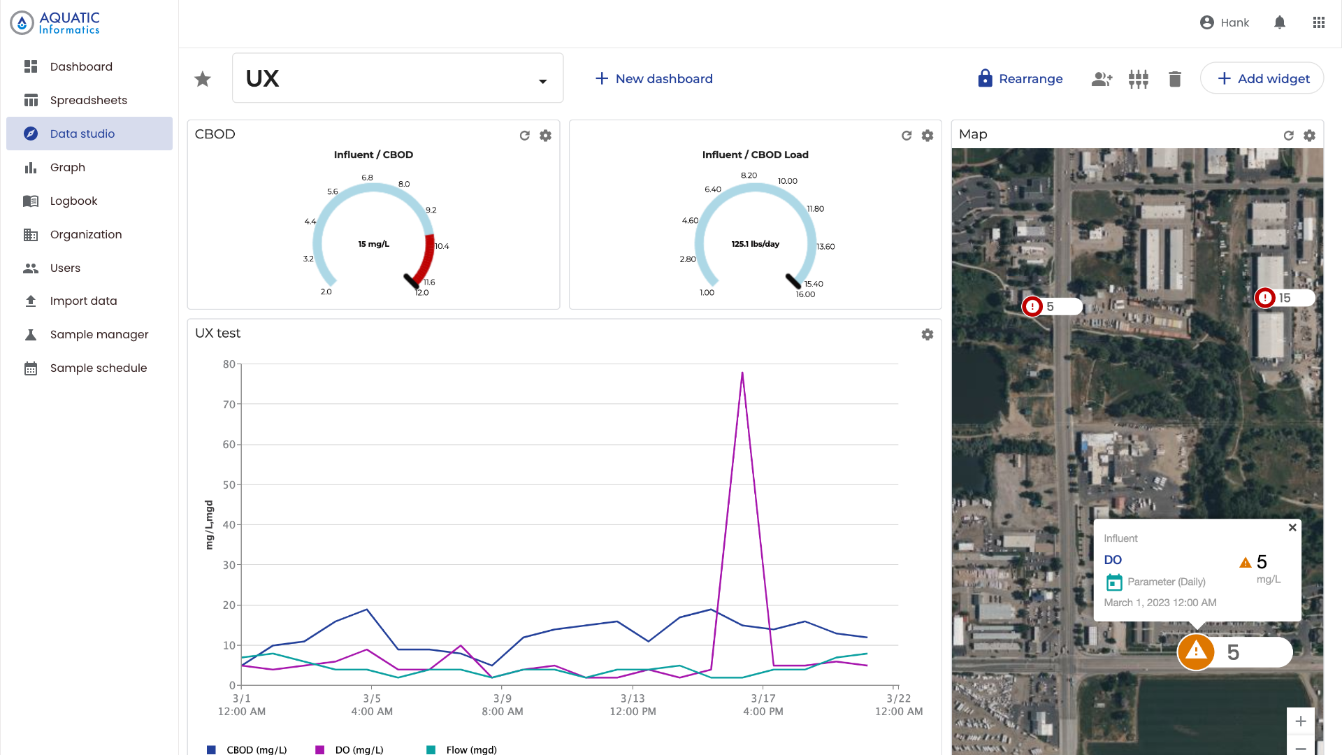
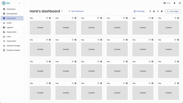
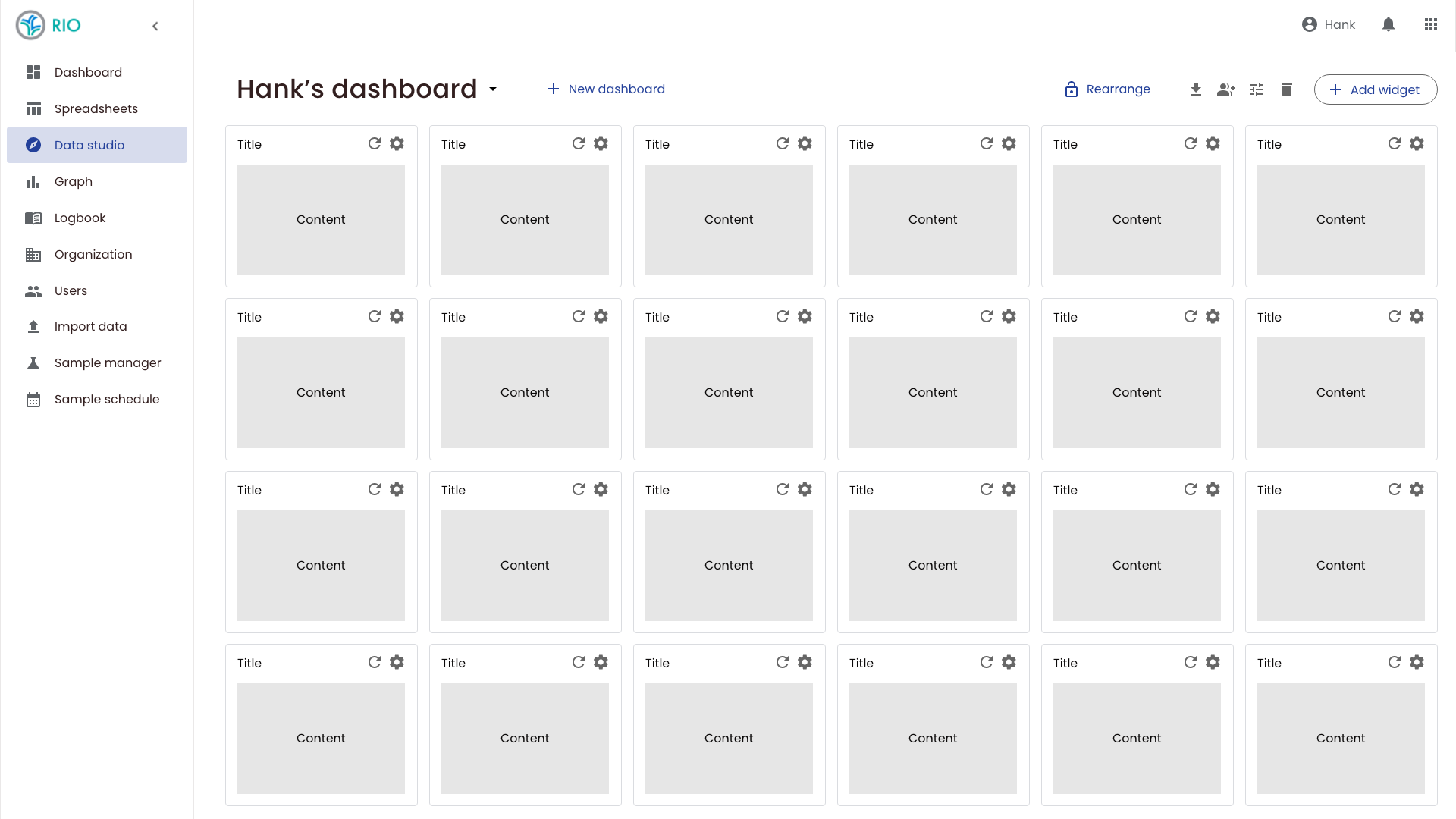
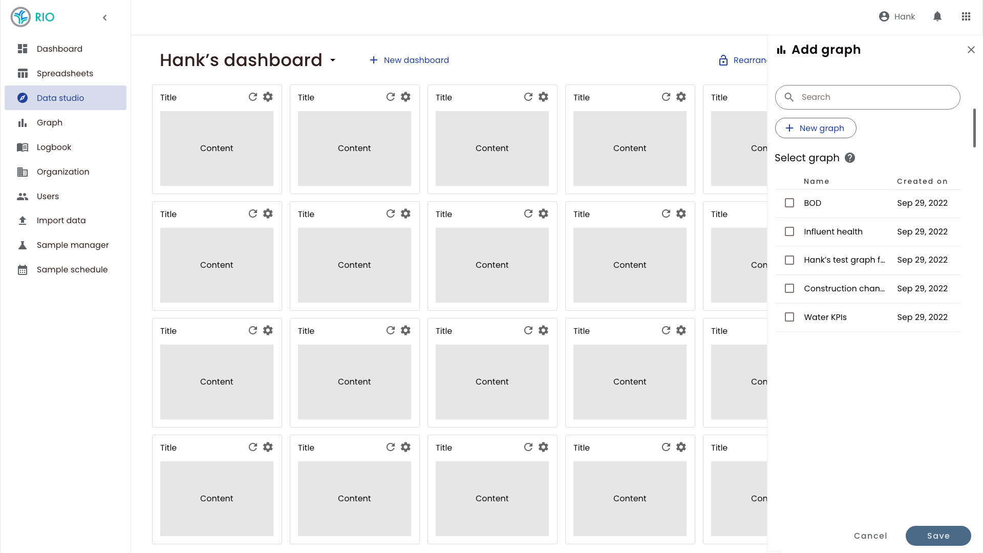
Dashboards
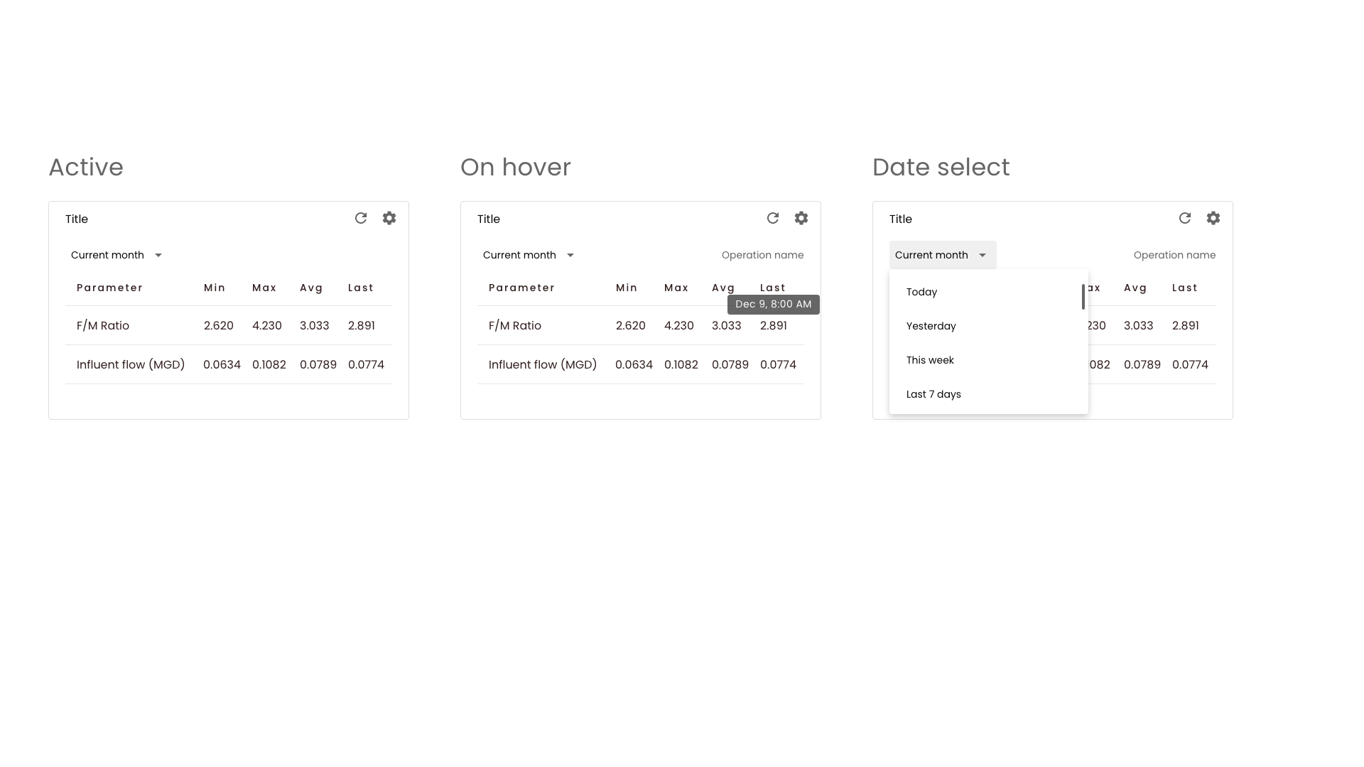
Dashboards were designed around easy to create and manipulate widgets that display important data touch points and KPIs around plant operation and compliance.
Based on our research, the dashboard would be a mixture of data visualizations types, charts, gauges, maps, and tables that would display real-time information as well as relevent past data.
One of the key findings based on user research was the need to contain dashboard information on a single screen (most facilities have a central hub that will have a large monitor mounted on the wall which is used to display plant health). We also discovered that users needed dashboards that are simple to create and modify.
Dashboard design: creating a modular system
I designed a modular system as the foundation of the dashboard based on a grid that would be used for placement and resizing of the dashboard elements.
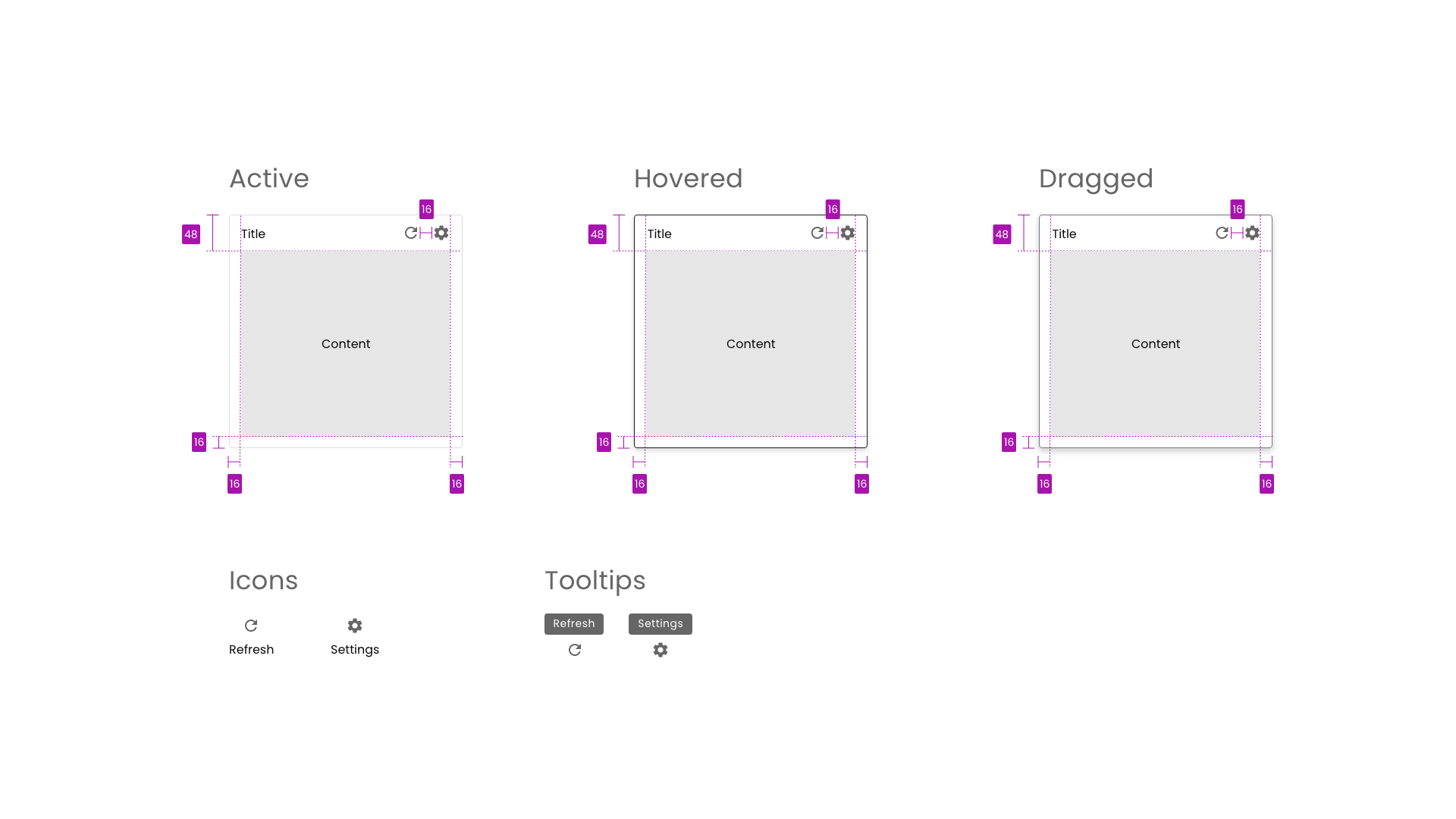
The foundational card element represents the smallest individual unit on the dashboard.
I then designed out each of the key widgets that could be contained within the card.
Individual card types were speced for interaction.

Each card also contained the specifications for related elements and positioning.
The actual dashboard system would contain the grid. The grid would be hidden from users until they need to move a widget or adjust its size.
All of the key interactive elements of the dashboard and the widgets were placed on the cards and the dashboard as a whole to help guide user discovery (a pattern that is replicated throughout the software).
Based on user research, I designed the dashboards to be self contained. Any element that a user wanted to add to the dashboard could be created from the dashboard as opposed to creating elements in other sections of Rio and link them through to the dashboard.
Spreadsheets
Spreadsheets mark the heart of the Rio system. The spreadsheet stores all of the plant data from a number of different sources including large-scale SCADA systems as well as lab data, and mobile collection.
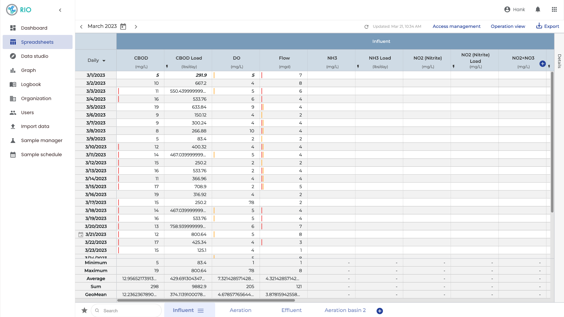
Colors and icons give users a quick visual understanding of the water health.
One of the key elements of making the spreadsheets usable was to give users easy and robust configuration of the water’s parameters (represented as columns on the spreadsheet).
Users can also drag and drop columns and groups of columns as well as add metadata about parameters all from the spreadsheet view.
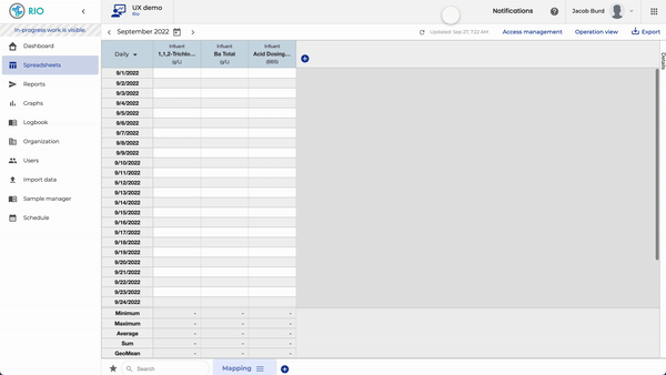
Mobile spreadsheets
The spreadsheets needed to function for mobile collection of data as well. Every iteration on mobile design required me to continue to simplify the interactions and data exposed to users to a minimum so that the interface never stood in the way of simple data inputs.
Rudi’s task for mobile collection was to gather information from instruments around the facility and at diverse locations throughout the city and quickly input values that would then be saved tot he main spreadsheet in Rio.
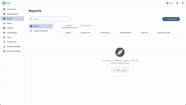
Reports
Reports are a critical function of Martin’s work flow. Reports not only encapsulate regulatory information required by state and federal agencies but also cover general information about water health and operational KPIs.
We’ve also broken report creation into more defined workflows based on Martin’s needs. Another important component is the ability to preview reports before exporting.
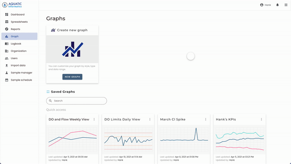
Graphs
The most important thing we heard from users was the need to create graphs that were quick and easy to use. To that end, I kept all interactions visible to the user for easy discovery.